
Introduction
Getting Started
@Grab(group='com.craigburke.document', module='pdf', version='0.5.0')
@Grab(group='com.craigburke.document', module='word', version='0.5.0')

import com.craigburke.document.builder.PdfDocumentBuilder
import com.craigburke.document.builder.WordDocumentBuilder

def wordBuilder = new WordDocumentBuilder(new File('example.docx'))
def pdfBuilder = new PdfDocumentBuilder(new File('example.pdf'))

wordBuilder.create {
    document {
        paragraph 'Hello World (Word)'
    }
}

pdfBuilder.create {
    document {
        paragraph 'Hello World (PDF)'
    }
}
Paragraphs
A paragraph is a block element that can contain text or images and have margins and alignment applied to it.
builder.create {
document {
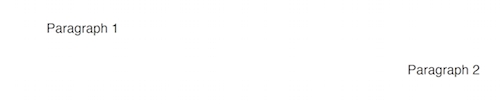
paragraph 'Paragraph 1', margin: [left: 1.inch, top: 0] (1)
paragraph 'Paragraph 2', align: 'right' (2)
}
}| 1 | Custom paragraph margin |
| 2 | Sets the alignment to right for all the content in the paragraph |
Text
You can add text to a paragraph by passing the value of the text to the constructor or by creating a series of text elements
builder.create {
document {
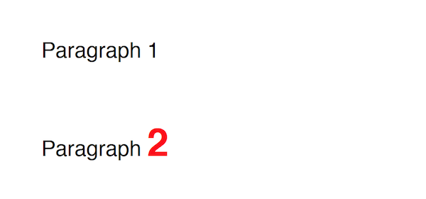
paragraph 'Paragraph 1' (1)
paragraph { (2)
text 'Paragraph '
text '2', font: [bold: true, size: 22.pt, color: '#FF0000'] (3)
}
}
}| 1 | Paragraph text set by the constructor |
| 2 | Paragraph text set by individual text elements |
| 3 | By breaking the paragraph text into text elements we can change the style of individual portions of the text |
Basic Text Formatting
The font property can be set on most elements and much like Cascading Style Sheets (CSS), font styles are inherited and can be individually overridden.
builder.create {
document(font: [family: 'Helvetica', color: '#000000', size: 14.pt]) { (1)
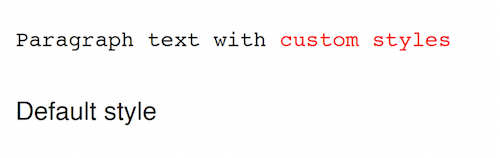
paragraph(font: [family: 'Courier', size: 12.pt]) {
text 'Paragraph text with ' (2)
text 'custom styles', font: [color: '#FF0000'] (3)
}
paragraph 'Default style' (4)
}
}| 1 | Sets the defaults for font family, color and size for all text in the document |
| 2 | The paragraph text inherits font family and color from the document but the font size from the paragraph. |
| 3 | Here the font color is overridden at the text level |
| 4 | Nothing has been overridden so the default document font styles apply here |
Advanced Text Formatting
In addition to being able to set the font property while creating an element you can also directly change the text styling at any point allowing you to do some interesting things.
String[] COLORS = ['#FF0000', '#FF7F00', '#FFFF00', '#00FF00', '#0000FF', '#4B0082', '#8B00FF']
builder.create {
document {
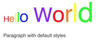
paragraph(font: [size: 20.pt]) { (1)
"Hello World".eachWithIndex { letter, index ->
font.color = COLORS[ index % COLORS.size() ] (2)
text letter
font.size += 5 (3)
}
}
paragraph "Paragraph with default styles" (4)
}
}| 1 | Initial font size for the first paragraph is 20 points. |
| 2 | Alternate through the different colors of the rainbow for each letter |
| 3 | Increase the font size by 5 point of each letter |
| 4 | The styles in this paragraph are unaffected by the changes within the first paragraph |
Images
You can add an image to a paragraph by providing the bytes of the image as well as a unique file name.
String GROOVY_IMAGE_URL = 'http://www.craigburke.com/images/posts/groovy-logo.png'
byte[] imageData = new URL(GROOVY_IMAGE_URL).bytes (1)

builder.create {
    document {
        paragraph {
            image(data: imageData, height: 106.px, width: 213.px, name: 'groovy.png') (2)
        }
    }
}| 1 | We need to provide the bytes of the image |
| 2 | In addition to the bytes we can optionally include a name. The height and the width if not specified will default to the dimensions of the raw image. |
Line Breaks
Line breaks are added to a paragraph whenever there’s a newline character in the text. A line break can be explicitly added by calling lineBreak
builder.create {
    document {
        paragraph 'John Doe\n123 Fake Street' (1)

        paragraph 'John Doe'
        lineBreak() (2)
        paragraph '123 Fake Street'

    }
}| 1 | Implicit line break because of newline character |
| 2 | Explicit linebreak |
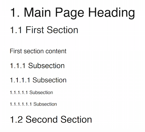
Headings
Headings can be styled much like simple paragraphs (with margins, alignment and text style) and are used to create a document structure. Headings with levels 1-6 can be used to denote sections.
builder.create {
    document {
        heading1 '1. Main Page Heading' (1)

        heading2 '1.1 First Section', font: [color: '#333333'] (2)
        paragraph 'First section content'

        heading3 '1.1.1 Subsection' (3)
        heading4 '1.1.1.1 Subsection'
        heading5 '1.1.1.1.1 Subsection'
        heading6 '1.1.1.1.1.1 Subsection'

        heading2 '1.2 Second Section' (4)
    }
}| 1 | Main document heading |
| 2 | The first main section of the document and also contains custom text styling |
| 3 | A subsection within the first section |
| 4 | The second main section of the document |
Tables
Tables are another block element that can have custom margins. There is also the border and padding properties that change how the tables are rendered.
builder.create {
    document {
        table {  (1)
            row {
                cell 'Cell1'
                cell {
                    text 'Cell2' (2)
                }
            }
        }

        table(width: 6.inches, padding: 20.px, border: [size: 3.px, color: '#FF0000']) { (3)
            row {
                cell 'Cell1'
                cell 'Cell2', align: 'right' (4)
            }
        }

    }
}| 1 | Table with default padding, width and border. If not specified width is 100% of the available area. |
| 2 | The cell contains a single paragraph so the same elements can be added here (text, images or line breaks). |
| 3 | Table with custom width padding and border |
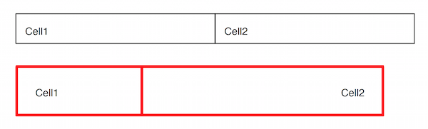
| A table with a border size of 0 can be used to build more complex layouts. |
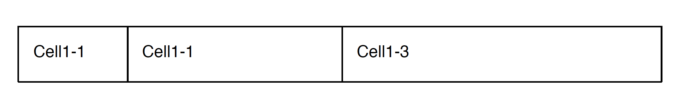
Column Widths
By default all widths are given equal width based on the width of the table but you can also set the relative widths of each column with the columns property.
builder.create {
    document {
        table(columns: [1,2,3]) { (1)
            row {
                cell 'Cell1-1'
                cell 'Cell1-1' (2)
                cell 'Cell1-3' (3)
            }
        }
    }
}| 1 | Proportional widths are set using the columns property |
| 2 | This cell is twice the width of the first cell |
| 3 | This cell is three times the width of the first cell |
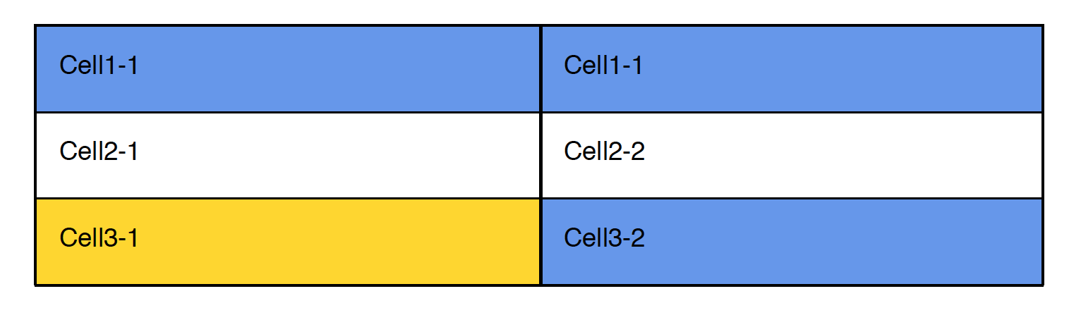
Backgrounds
You can set a background color using the background property at the table, row or cell level.
builder.create {
    document {
        table(background: '#6495ED') { (1)
            row {
                cell 'Cell1-1'
                cell 'Cell1-1'
            }
            row(background: '#FFFFFF') { (2)
               cell 'Cell2-1'
               cell 'Cell2-2'
            }
            row {
               cell 'Cell3-1', background: '#FFD700' (3)
               cell 'Cell3-2'
            }
        }
    }
}| 1 | Background color set for the entire table |
| 2 | The table background is overridden for this particular row |
| 3 | Background set on an individual cell |
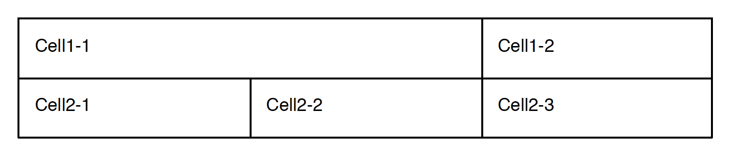
Column Spanning
A cell can span multiple columns through use of the colspan property.
builder.create {
    document {
        table {
            row {
                cell 'Cell1', colspan: 2 (1)
                cell 'Cell1-2'
            }
            row {
                cell 'Cell2-1'
                cell 'Cell2-2'
                cell 'Cell2-3'
            }
        }
    }
}| 1 | This cell will span the normal width of the first two cells |
Row Spanning
In addition to spanning multiple columns, a cell can also span multiple row through use of the rowspan property.
builder.create {
    document {
        table {
            row {
                cell 'Cell1-1', rowspan: 2 (1)
                cell 'Cell1-2'
                cell 'Cell1-3'
            }
            row { (2)
                cell 'Cell2-1'
                cell 'Cell2-2'
            }
            row {
                cell 'Cell3-1'
                cell 'Cell3-2'
                cell 'Cell3-3'
            }
        }
    }
}| 1 | This cell will span the first two rows. |
| 2 | This row has only two cells to a accomodate the cell from the first row |
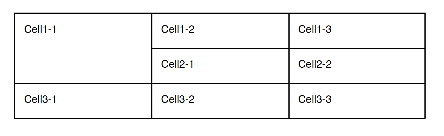
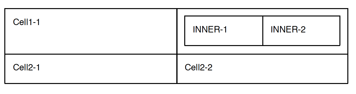
Table Content
In addition to the standard paragraph content, a cell can also contain another table
builder.create {
    document {
        table {
            row {
                cell {
                    text 'Cell1-1' (2)
                }
                cell { (1)
                    table {
                        row {
                            cell 'INNER-1'
                            cell 'INNER-2'
                        }
                    }
                }
            }
            row {
                cell 'Cell2-1' (3)
                cell 'Cell2-2'
            }
        }
    }
}| 1 | We can use all the typical paragraph content (such as text or image) and they are added to an implicit paragraph of this cell. |
| 2 | Instead of paragraph content we can also add another table within this cell. |
| 3 | We can also add cell text directly using the constructor. |
Document
Units
All numeric values like font size and margins are by default specified in terms of points. Since this isn’t always the most natural way to express a value you can also set these values in terms of either inches, pixels, or points and the coversion will be done for you
builder.create {
    document(margin: [top: 2.inches, bottom: 1.inch) { (1)
        paragraph 'Hello World', font: [size: 14.pt] { (2)
            image(height: 120.px, width: 130.px, data: imageData, name: 'foo.png') (3)
        }
    }
}| 1 | Both top and bottom margin set in inches |
| 2 | Font size set in points |
| 3 | Height and width of image set in pixels |
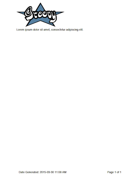
Headers and Footers
The header and footer should be specified as a closure. This closure should contain either a single table or a single paragraph that will be rendered on each page.
String GROOVY_IMAGE_URL = 'http://www.craigburke.com/images/posts/groovy-logo.png'
byte[] imageData = new URL(GROOVY_IMAGE_URL).bytes

builder.create {
    document(
        margin: [top: 1.5.inches, bottom: 1.inch], (1)
        pageCount: 1, (2)
        header: { info ->
            paragraph { (3)
                image(data: imageData, height: 106.px, width: 213.px, name: 'groovy.png') (4)
            }
        },
        footer: { info ->
            table(border: [size: 0]) {
                row {
                    cell "Date Generated: ${info.dateGenerated.format('yyyy-MM-dd hh:mm a')}" (5)
                    cell "Page ${info.pageNumber} of ${info.pageCount}", align: 'right' (6)
                }
            }
        }
    ){
        paragraph 'Lorem ipsum dolor sit amet, consectetur adipiscing elit.'
    }
}| 1 | The header and footers reside in the margins of the page so it’s important that the top and bottom are large enough. |
| 2 | If you display the pageCount within the header or footer it must be set here for the Word Builder (this can be omitted for the Pdf Builder) |
| 3 | Both the header and footer can either be a single paragraph or table. |
| 4 | You can include images in addition to formatted text in your headers and footers. |
| 5 | The dateGenerated property is a Date value that can be used in either the header or footer |
| 6 | The pageNumber and pageCount are String values |
Templates and Styles
In addition to setting the font styles for each paragraph individually you can also set general defaults with the template setting.
def customTemplate = {
    'document' font: [family: 'Helvetica', size: 13.pt], margin: [top: 1.5.inches] (1)
    'paragraph' font: [color: '#333333'] (2)
    'paragraph.myStyle' font: [bold: true] (3)
}

builder.create {
    document(template: customTemplate) {
        paragraph 'Hello'
        paragraph 'Paragraph with style applied', style: 'myStyle'
    }
}| 1 | Special units (like pt and inches) can be used within template closure |
| 2 | Sets a default for all paragraphs |
| 3 | Sets a specific style that is applied when a paragraph has the style myStyle |
Page Breaks
Although new pages are automatically created to accommodate content but you can also add an explicit page break.
builder.create {
    document {
        paragraph 'This will be on page 1'
        pageBreak() (1)
        paragraph 'This will be on page 2'
    }
}| 1 | Page break happens here regardless of how much content came before |